tirsdag 22. februar 2011

Project L

Our class were going to make a Logo which represents a store or a product. In this task, much planning had to be done. Before we could use our creative skills to make this Logo, we had to figure out a "Concept". This concept had 4 parts: "What" is it, "Who" are you trying to reach with it and "Which" associations do you want to make and "How".
     On the first step, "What", I chose my store/achievement to be a Pancake restaurant with a forest theme. The main idea was to make it look like you were outside, when inside. Get it? It should be sold cheap pancakes.
     Step two, "Who": My target group is: Hiking -, Nature-loveing -, Lumbering -, Pancake-eating - people. With other words, people that likes pancakes as a meal on their trip.
     Step 3, "Which": The associations I wanted to make were: Relaxed, Fresh nature etc. With my logo, i set these thoughts in centre. What do you think about when you see this logo?

 And this logo is how I want to bring the associations to my target group (Step 4).
The Orange tree can associate nature, life, or a tree.
The blue circle can associate the sky, a circle or even a pancake.
The wooden font can associate wood, forest or western, depends on each person.

When this information were done, we could start making the logo. I found the name Pancake Cabin, and I used the two first letters in the words to make it be PaCa. It is easier to remember, and faster to pronounce. PaCa PaCa PaCa. If someone wonder how I made this logo, I only used Elipse tool and Pen tool. Otherwise i used the Text tool for the text. When my logo was completed, the Design-manual was next in line. It contained 7 tasks :O.
1) Make the logo in colors and black and white. Try it with different color backgrounds.
2) Write the fonts you used.
3) List up the colors you used in the logo and the number in both CMYK and RGB.
4) Decorative element.
5) Make a business card.
6) Use Photoshop to make the "facing".
7) Free choice element, make the logo on a cup, car, cloth etc.
Wow, this is much to do, don't you agree? Well, here is my way to do it:
On the upper left, you can see step 1. Below step 2 and 3. Lower left is the Business card. Upper right is the Facing and on the lower right you can see step 4 and 7, where I've used my logo on two elements. Ta-da. 
This manual is a guide on how you can show a product to a customer. This is my logo, and maybe you one day will see it on a facing? Who knows?

Have a nice Day!
This was posted 12:52

tirsdag 11. januar 2011

The evil Giraffe named Stig

You have already met my awesome giraffe, and now he's in a cartoon! First, some background info about this giraffe: He is 11 years (human year) which is very old for a Giraffe. They can live 10-20 years. He lives on the north pole because he works as a santa claus substitute. That's why he's wearing a santa hat. When he was younger, he experienced something terrible. He didn't get anything of what he wished for christmas, and now he is trying to make that happen to all the other children in the world. Very sad story, actually. But, someone is suspicious about this evil giraffe, and tries to stop his plan. It is the hyena Nils! He is an agent sent by the hyenas to stop him. Well, enough of this, lets look at the cartoon instead:
The text is a little hard to read, because this was the largest file i could upload, and it's written in Norwegian. In the first route Stig climbs a tree to see if there are no hyenas. 2. He says: "To the secret lab!" and the lab is on a toilet. 3. "When I push this button, no letters will arrive to santa, and my plan has come true!" did he say just when: knock knock ... BANG! The hyena Nils kicked down the door on Stig. 4. "Nils the hyena, you will regret this! Mohahahah!" and he pushes the button. "Go Robot-Giraffe!". Robot-giraffe: Loading... Loading... Loading completed bip bip. Then Nils says: -Teleport activated- and teleports out of the house. Stig doesn't understand what just happened. 5. Stig: "Robot-Giraffe attack!!!" Nils: "Are you kidding me?..." Nils uses a karatèkick to stop his attack. Stig yells NOOOOOOOO, and Nils says "Mission completed". The End.


Im not gonna make a tutorial on this one, because it would take a year. I made everything in Adobe Illustrator CS5.
Click on the image to see it larger.


Have a nice Day!
This message was posted 12.20

My super awesome Giraff(e)!

Have you ever wanted to make your own giraffe? Then this is an opportunity you cannot miss! In our subject; Project to indentation, we were to choose 1 of 3 tasks. We could make a DVD-cover, an illustration of a good and a bad thing that computers do to children or make your own cartoon character. I chose the last. And then my creative powers figured out, why not make a giraffe? Excellent choice! I Google-d Giraffe on pictures and found a lot of inspiration, the most of the pictures were kind of weird though. If you are still interested in how "I" made a giraffe, continue reading, and for they who already got bored by this text; Look at the pictures or leave! Before we start, I must say that you should have the Layers window open. If you haven't, go to Window in the menu, and select Layers. Each time you start on a new part or want to combine something, it is very smart to use Layers. Then you can drag an item above or beneath, and it makes it much easier to hide or show layers or just 1 item.


First of all I have to show you my awesome creation: 
Do you like it?
Of course you do. Well, in fact, this little giraffe contains 207 pieces that I made in Adobe Illustrator CS5. I have counted them, it took a while, but I counted it! You may think: "No way, I don't believe there is 207 pieces in that giraffe" but your wrong!!! I'll explain how i made this in a very long and fantastic TUTORiAL. Dan, Dan, DAN!


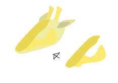
First you open the program, or any program you'd like to paint a giraffe in. Then, where shall I start. I'll start with the head. Select the Pen Tool (Shortcut Press the P key). Make an organic form that looks like a giraffe head, Maybe like this:
This is not a shoe. If you add ears, those pointy things on its head and mouth and eyes it will look more like a head.


To make it look a little bit real, i add some weird forms that looks like different colors in the fur like shown on the              picture:
After the head is finished, the very long neck follows. Simply make something that looks like a neck and make it more fancy afterwards. And by the way, this far I have already made 8 pieces, and that's just on the head. Ha! Never mind that. 


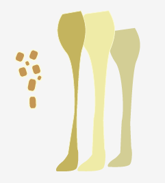
My neck looks like this:
Isn't it beautiful? Well, it's not finished yet... If i add some other skin colors and some dots it will be perfect. To make the dots, or the dotted pattern on the giraffe, use the Rounded Rectangle Tool. To access this tool, click and hold on the Rectangle Tool and choose the Rounded Rectangle Tool. Then make many dots, but not make everyone the same size or form. Then it will look weird.
Ok, he has a neck, so now he can eat his food from trees. Yay. Now he needs a body, and that is complicated. To get the perfect form, just start. Draw something, and if you can use it, use it. It will probably be hard to make it fit with the neck, but just add more using pen tool to make it fit. I did use many pieces that actually were meant to be 1. Shown on the picture below....


Add some fancy forms with different colors to make shadows or changes in the fur. You don't have to, it's ok if you want a complete yellow giraffe. It is practical to take the dots in the end, or else you have to move or rotate them if they don't fit, since we are heading towards the legs. The legs are tricky, it is 4 of them. o.o But I made 6... haha. Well, it may look like 6 legs but it is 4... As the picture shows, there are 3 legs, and 1 set of dots. The little and gray leg is on the other side of the giraffe, and we don't see it clearly. The other 2 legs are combined to be 1 leg, with some fancy shadows on. If you have succeeded to make 4 legs you have to place them on the giraffe. Pretty obvious. 
Place them where it looks like they should have been if it was a real giraffe. Remember, I am still using the pen tool, the dots and the eye is the only items that I've not used pen tool on. You are close to the finish of a great invention, too bad i already invented it :D. Now, the only thing thats left, is the Tail and its pretty hair. Make the tail using the pen tool. Draw a line and make the stroke larger, i have it on 5mm. Decorate it with dots, and finish it by draw a bunch of lines at the end. The hair is made the same way, draw a line and color it. You got a giraffe. But, we don't want a giraffe, do we? We want an super awesome giraffe! I made mine as an evil santa claus substitute that tries to prevent children from getting presents at christmas. I bet you can't top that one! Or if you do, I would like to hear about it :)


Have a nice New Year!
This message was posted 10.45

fredag 8. oktober 2010

Typography

This week we learned about typography. We learned the difference between Antiqua- and Gothic- fonts. Antiqua has small "foots" on each leg: A. An example on Antiqua is the font TimesGothic don`t have these foots on, and they look like the font I`m writing with now, Verdana. In English this font type is named Gothic, but it is 2 font families named that. The gothic family is known by using letters like this: 


The Gothic font I`m talking about is the category Gothic that represents fonts like Verdana, Arial and Helvetica.
The task of the week was to write our schools name; Vågen Videregående Skole, and the name of the class; Medier og Kommunikasjon. We should try out 5 different contrasts to write in: Form/shape contrast, Size contrast, Strength contrast, Value contrast and Dynamic contrast. Examples follows.....:


Form Contrast:
Fonts with different form put together creates formcontrast.
Strength Contrast:
Differences that occur between Fonts of the same family that has unlike strength and weight.
Size Contrast:
The same shape or the same font of different size.


Value Contrast:
Clean value - or color-contrast.
Dynamic Contrast:
Variousness as big as possible.
These is the contrasts we went trough. This was task 1 out of 3. task 2 was to draw the 2 different font styles, Antiqua and Gothic, on paper. So I can`t upload it. Task 3 was to make a T-shirt design with fonts. That was funny. I`ll show you the result of my T-shirt:::::::
I used 2 contrasts: Size contrast, and Value contrast. I`m very proud of it, and it is not because Garfield joined it. Just so you`ll know, this design is created by fonts ONLY! If you don`t believe me, read the following sentence: The sleeping/dead Garfield is the symbol in the picture to the right.
  I downloaded the font "Garfield" and that is why the pictures of garfield is a letter or symbol.... Ok, the "blood" isn`t a font, you got me, I admit it. If you want to download this font, simply go to dafont.com and search for Garfield.


If this was a T-shirt, would you have bought it? I would :P


Spell ya l8er!


And by the way, later is after the vacation.
Have a nice Vacation!
I am tired of the publishing time, that always shows the wrong time. I did not publish this 0.40, or whatever. This post was published 10.26 in the morning.

torsdag 7. oktober 2010

Photo - Depth of field (Dybdeskarphet)

When we learned about the Camera operations and what differences they could do with a photo, we should try out those functions in practice. I, and 2 other pupils did it together. We were to choose a random task from what we had learned, and take 2 photos to show the difference. We got the theme named: Depth of field (DOF). The task read that we should first take a photo with the largest aperture (blenderåpning). And task 2 said the opposite.We should also find a clearly Foreground, background and one between. Here is the photo shot with the largest aperture (lowest number):
Aperture size: 5,6
Aperture size: 36


The foreground here, is the flower, and you can se a clear difference between the flower and the background. It looks like the flower is far away from the background.


In this photo, the background comes closer to the flower, and it doesn`t look like a great distance. The trick is that the distance is the same in both photos. But by only changing the aperture makes a large difference.


Small aperture size makes big sharpness in the depth, but large makes little sharpness.


Remember, the smaller the number, the larger the aperture and the same with larger number - smaller aperture.
My English isn`t the best, so I might have spelled the photo expressions wrong, because we learned them in Norwegian.


Have a nice Day!

tirsdag 5. oktober 2010

Banner

When we were (Www :P) done creating the blog that you`re reading, we got this task: to make a banner for the blog. That`s the picture on top of the website. This is how mine looks like:
When you look at it, the font is like a cold flame, that burns the letters. I like to work with typography, so I wanted to make the logo/banner cool. This banner occurred by an accident actually. I was trying out the fancy effects in photoshop, and it suddenly ended up as this. Hehe, so I will try to redo the progress without knowing the exact way to do it :P


First we had to choose the image size. Here is the recipe:
Width: 900 pixels. Height: 200 pixels. 72 ppi. Color Mode: RGB 8 bit.
This window pop up when you make a new document in photoshop.


I started with the Text tool. Font: Arial. Font Size: 72px. I wrote a letter, in this case an F. Important info: Only make 1 letter. Then choose the Brush Tool. Then you might wonder what kind of brushes or brush size your gonna use. Here is what I used:


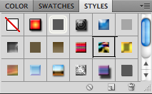
If you have problems to see what is shown in the image, ill explain. The marked brush style (the square with the black outlines) is the one I used, but I chose Size 8 px. In the image to the left, is the F that i made. When you have chosen the Brush, then click on the document. Then a pop up will appear. Click ok, and then the text Layer will transform into a normal Layer. Then you can Edit the "F" like a normal photo. Use the brush to make the letter into a "cloudy" letter. (see the picture to the left.) How? Change the color into White. Then draw randomly lines over the letter till your happy with the look. Then continue the progress with the other letters, but remember, 1 letter at a time. To check if your on the right way, you will end up with 1 Layer for each letter. When I wrote and brushed the word: "FREDRiK`s" I marked all Layers and went over to the Styles window:
Choose the style that is marked on the picture (Nebula). Then the Then the letters will look a bit weird, or maybe you like it:
Ok, in the image I have already done the other words, but I will explain how, so don`t do the exact same progress on the next 


part. 
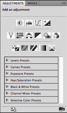
Now write "D i G i T A L   A R T" or whatever you wanna write. Use the same font, but use size 60px. Write this as 1 sentence, and on 1 Layer. Then make the letters "cloudy" by using the same Brush settings. After you`re satisfied, go to the Styles window and choose the Puzzle effect. (The grey square under the white with a red line) Then it will look a bit different from the other word. When this is completed, the next step follows. This was kind of the easy part, or it was the easiest part to understand. Now I`m gonna make the whole image more bluely by play with the Adjustments window:
The small pictures shows what type of adjustments you can choose between. In this tutorial I`m gonna use: Brightness/Contrast, Levels and Photo Filter. 


First click on the Photo Filter. It will show a square colored Orange. Click on it to change the color to what you want: 


Then click on the Level button, and try to change it.
Levels
Brightness/Contrast
After that, click on the Brightness/Contrast button, and change the contrast or brightness to where it is acceptable to have them.


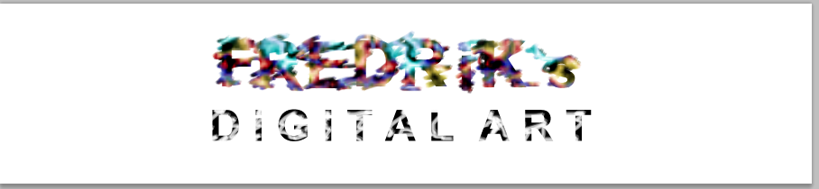
After you have tested, tried and adjusted to the infinity and beyond, you have finally succeeded to make exactly what I made. Then your letters or words will look cool, fancy or amazing:
The finished banner.
Remember, I made this creation by accident, and I am not the best source to how this works, but if you want to make a banner like this, then you can listen to what I`m saying.


Have a nice Day!

fredag 1. oktober 2010

Pan

If we`d finished the photo collage before the deadline had arrived, we could set our skills on a trial. We could make a Pan picture, with 3-8 photographies put together like a long picture. I shot 7 pictures in portrait format. That`s the easy part. After the "easy" part, the "a little bit harder part, but still an easy part" follows. The first thing to do, is OPEN Adobe Photoshop CS5. Then go to File-Scripts-Load Files into stack... 


Then choose the images you want to load, and click open.


Then you will get a bunch of layers, and it doesn`t make much sense at all, like shown way below...


Left click on the upper Layer to mark it Blue. Hold down the SHIFT button, and left click on the lowest Layer to mark all. Then go to edit, in the menu, and then Auto-Align Layers. Then it will pop up a window with multiple choices. Choose Auto and press OK. Then let it load, don`t cancel it. After the loading is completed, your image will look like this: (The motive in the picture will not look the same).


You can see the light changes in the picture, and you will probably not have that in the picture. Go to Edit-Autoblend Layers:


Then this wonderful program simply do all the work for you, and your picture does look just like it should be. 


Crop the image to where you want it to be, and press enter.


Then your picture/image/photo/photography is completely completed. My picture looks like this:


Hope this helped they who wanted to be helped in exact this theme. And this wasn`t actually a hard task, but I learned how to do it :P


Have a nice Day!