

First we had to choose the image size. Here is the recipe:
Width: 900 pixels. Height: 200 pixels. 72 ppi. Color Mode: RGB 8 bit.
This window pop up when you make a new document in photoshop.
I started with the Text tool. Font: Arial. Font Size: 72px. I wrote a letter, in this case an F. Important info: Only make 1 letter. Then choose the Brush Tool. Then you might wonder what kind of brushes or brush size your gonna use. Here is what I used:

 If you have problems to see what is shown in the image, ill explain. The marked brush style (the square with the black outlines) is the one I used, but I chose Size 8 px. In the image to the left, is the F that i made. When you have chosen the Brush, then click on the document. Then a pop up will appear. Click ok, and then the text Layer will transform into a normal Layer. Then you can Edit the "F" like a normal photo. Use the brush to make the letter into a "cloudy" letter. (see the picture to the left.) How? Change the color into White. Then draw randomly lines over the letter till your happy with the look. Then continue the progress with the other letters, but remember, 1 letter at a time. To check if your on the right way, you will end up with 1 Layer for each letter. When I wrote and brushed the word: "FREDRiK`s" I marked all Layers and went over to the Styles window:
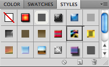 Choose the style that is marked on the picture (Nebula). Then the Then the letters will look a bit weird, or maybe you like it:
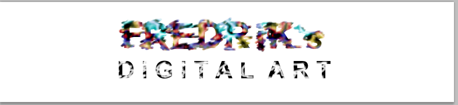 Ok, in the image I have already done the other words, but I will explain how, so don`t do the exact same progress on the next
 part.
Now write "D i G i T A L A R T" or whatever you wanna write. Use the same font, but use size 60px. Write this as 1 sentence, and on 1 Layer. Then make the letters "cloudy" by using the same Brush settings. After you`re satisfied, go to the Styles window and choose the Puzzle effect. (The grey square under the white with a red line) Then it will look a bit different from the other word. When this is completed, the next step follows. This was kind of the easy part, or it was the easiest part to understand. Now I`m gonna make the whole image more bluely by play with the Adjustments window:
The small pictures shows what type of adjustments you can choose between. In this tutorial I`m gonna use: Brightness/Contrast, Levels and Photo Filter.


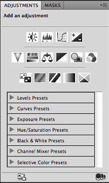 First click on the Photo Filter. It will show a square colored Orange. Click on it to change the color to what you want:
Then click on the Level button, and try to change it.
 |
| Levels |
 |
| Brightness/Contrast |
After you have tested, tried and adjusted to the infinity and beyond, you have finally succeeded to make exactly what I made. Then your letters or words will look cool, fancy or amazing:
 |
| The finished banner. |
Have a nice Day!
Ingen kommentarer:
Legg inn en kommentar