
mandag 26. desember 2011
mandag 12. desember 2011
Christmas Tree!
Hi, I got nothing else to say: Welcome to Build a Tree!


onsdag 19. oktober 2011
Da.. da.. DA. Da.. DA.. DA!... da...
Which song am I humming on? Keep this in mind while I force you to read by using logic...
Why is our brain
so fabulous?
Faster then a train;
so marvelous.
Smarter then us;
we can't understand.
If thrown off a bus,
where would it land?
It's still a mystery,
why we can't grasp brains.
Would it be wisely,
to bind it with chains?
I think I am becoming a poet, because I've recently made two poems this week, about brains... and penguins.
The reason why I made this poem, IS!: To make an excuse for my newest creation. It was late afternoon. I had finished my homework, and I had time to digest the dinner. The weather was horrible, so I sat in the living room, with my little brother, mother, and grandma. They watched boring TV programs, while I, for some reason, opened Photoshop (CS5). By the way, there is no tutorial this time, haha. I looked over some pictures I had shot earlier this year, and I found some funny pictures of Sheep. I kind of decided to make a collage/montage. After 2 hours of work, It ended up as this, and please, study it for a while, and try to find out how many pictures this picture contains. It is not less than 10:
 I made the picture small, so you must click on it to see it large. HAHA. and if you have slow internet connection, this picture is very large, and that did I on purpose to annoy you all. Mohaha. It is called: Ecologic Nightmare... :D
This image is under the category of Surrealism.
Have a nice and surrealistic day!
This supplication was posted 18.45
Why is our brain
so fabulous?
Faster then a train;
so marvelous.
Smarter then us;
we can't understand.
If thrown off a bus,
where would it land?
It's still a mystery,
why we can't grasp brains.
Would it be wisely,
to bind it with chains?
I think I am becoming a poet, because I've recently made two poems this week, about brains... and penguins.
The reason why I made this poem, IS!: To make an excuse for my newest creation. It was late afternoon. I had finished my homework, and I had time to digest the dinner. The weather was horrible, so I sat in the living room, with my little brother, mother, and grandma. They watched boring TV programs, while I, for some reason, opened Photoshop (CS5). By the way, there is no tutorial this time, haha. I looked over some pictures I had shot earlier this year, and I found some funny pictures of Sheep. I kind of decided to make a collage/montage. After 2 hours of work, It ended up as this, and please, study it for a while, and try to find out how many pictures this picture contains. It is not less than 10:

This image is under the category of Surrealism.
Have a nice and surrealistic day!
This supplication was posted 18.45
mandag 10. oktober 2011
Gradient Tool and Pixelate Effect in Illustrator!
Hello everybody, this is the moment one, or maybe two of you have waited for *drum roll* ... A brand new tutorial! In this supplication, I will hopefully succeed on learning someone how to use gradient tool and make a pixel effect in Adobe Illustrator cs5, and perhaps it will work in cs4 too...
 Gradient Tool! First of all, it's a tool, and second of all, it's a useful tool. With this tool you can avoid the boring and hard colors in your drawings. Gradient tool can be used to make sunset, where the color of the sky vary. Here's an example:

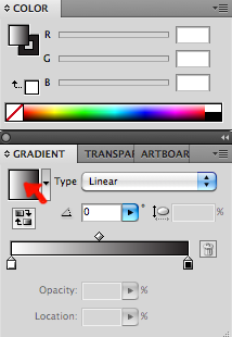
There is two ways to use Gradient Tool, and it might be easier to start with the first one. You will need to open the windows called Color and Gradient. Create a rectangle, or any other figure. Make sure you have marked it using the black arrow. Click on the square in the gradient window and your rectangle gets colored.
To change the color, click on the rectangle in the gradient window and some tags shows up. Click on one of them, and go to the color window to change it. You can choose between grayscale, rgb, cmyk etc. if you click on the tiny arrow on the top right of the window.
I chose RGB and the color light blue instead of white. If we take a look at this color bar, almost everyone of you will be able to see the tiny black and white square on top of it.
 Click and drag to adjust how much of each color you want. If you click below the bar, a new tag is created. You can make as many tags as you want, but there is a limit of space , so you can't make more than 30 or so. You can now choose where the fade shall start. You can color each tag with different colors, or an other nuance of the same color.

Now, for the next step open the Swatches window. The first time you open it, there will be many colors there already. To make your own color palette, go to the tiny arrow on the top right and choose Select all unused, then Delete Swatches.
If you are happy with the gradient, click on the color and drag it over to the swatches window. The color will be stored there. The colors you've saved will only stay in the current project.
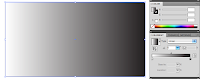
This was the first way to use gradient tool, and here comes the other. If you have a gradient color saved in swatches, use that one, or keep using the same you made during this tutorial. Make the color in the rectangle white.
 Then select Gradient Tool in the Tool box.
 Click somewhere outside the rectangle and drag a line almost through the rectangle.
Have fun with this Tool.
...........................................................................t...t...t...t...t...t...t...t...t...t...t...t...This tutorial is not finished yet. So do not leave! THIS was only the first part!
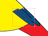
I have always wanted to draw a tree, with all the leaves on, but this seems like lot of work. Well, for the last project, I made some trees. They made the whole picture look like a catastrophe. The objects lost their coherence. There was no story for the picture to tell! But then, when my hope almost had disappeared, I managed to raise my hand, and just in time, a teacher came by and asked "what is it?". I nearly whispered the words "How...can...I...make...the...trees...look...like...trees...?". And then she said, and my hope went up a little :"I don't know, but maybe another teacher does?"... The other teacher came right before my hope left my soul, and i whispered the same sentence. She said: Well, we can try to use color halftone, it will make the color into pixel patterns. ... ... ... YES! I suddenly got my hope back! And now, I am going to share this feeling with you during this second part of this extremely long TUTORIAL! (By the way, I am not so sure, but I might be the only person with this much passion for trees.)
FIRST of ALL, make a tree. THEN, make many more trees, make a whole forest! Make it curl around a healthy and fresh-water river. Draw in a sunset using the gradient tool, and then color your forest with a nice and light green color. When all this (or just the forest) is done, we can start to absorb some useful experience.
Group the trees, that creates a forest. Or first you will have to make a tree......... Make many circles and set them together. Open Pathfinder window.
 THEN! Push this button when all the circles are marked:

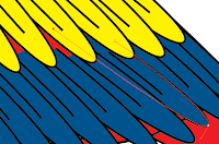
They will now connect to one form, which is good, since it's gonna be 1 tree, not 5 circles. Lets do something. Go to Effect, and then go to Pixelate and then go to Color Halftone!

A window will pop up, and you can choose max radius, I suggest 4 (minimum).
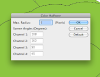
Now, this is the part where your patience comes in handy, because the more trees you made, the longer you will have to wait for the color halftone to finish. Hehe. It's so annoying, that I took a screenshot of it. You will see it later. If you ZOOOMe in, you see circles. Circles are definitely not pixels. So this effect should be renamed. But, it's perfect for §TREES!!!
Place your forest near the beautiful river. If you have used gradient tool on the rest of the picture, except the trees, you will have to make the trees gradient too. Mark the entire forest, and make a gradient which has the same color as the trees on the first end, and a lighter color on the other end of the bar.
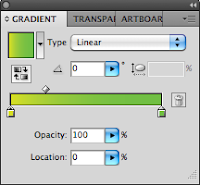
NB! When you make this gradient, don't have the trees marked yet, cause you will waaaaaaste very much time.
After making the gradient color, mark your forest and click on the color you just made. Adobe Illustrator CS5 will now use all it's powers to make the trees gradient, so prepare to wait. Meanwhile take a look at this screenshot of Illustrator working with it!
After the color halftone is done, activate the Gradient Tool from the tool box. Then, make sure to have some of the trees marked (I marked the left part first, since the sunlight changes the light on both sides). Then simply drag a line. Then the color halftone progress appears again... After it is finished, the gradient color will change.
Wow, the left side suddenly got so much better to look at. When you have this pixelate effect added, remember that every single change will cause the program to do the color halftone progress over and over again, even if you move it a little bit to the left. Well, meanwhile this progress is going on, you can try to read the words. There is two different sentences, the first is Color Halftone, and can you find out what the next is :O? (If you don't want to, it says: Rasterizing Artboard).
I am very sorry for making an extremely long tutorial, and this will never be repeated. The gradient tool part was ok, but I think I shouldn't made an entire background story to tell you why the pixelate effect looked nice on trees... Overdramatic...
This tutorial might be complicated to read and understand, so if you want, I can make a tutorial on how to understand my tutorial.
And now for something completely different! If you like the German language, and the New Norwegian language (Nynorsk) I recommend to turn on the TV at 5'o clock at NrK2. It's so worth it!
Have a nice day!
This supplication was posted 17.45


There is two ways to use Gradient Tool, and it might be easier to start with the first one. You will need to open the windows called Color and Gradient. Create a rectangle, or any other figure. Make sure you have marked it using the black arrow. Click on the square in the gradient window and your rectangle gets colored.

To change the color, click on the rectangle in the gradient window and some tags shows up. Click on one of them, and go to the color window to change it. You can choose between grayscale, rgb, cmyk etc. if you click on the tiny arrow on the top right of the window.
 |
| To the lower left you can see some tags, click on the white one to change its color. |
I chose RGB and the color light blue instead of white. If we take a look at this color bar, almost everyone of you will be able to see the tiny black and white square on top of it.

Now, for the next step open the Swatches window. The first time you open it, there will be many colors there already. To make your own color palette, go to the tiny arrow on the top right and choose Select all unused, then Delete Swatches.
 |
| Make your own color palette. |
 |
| Drag the color over to the Swatches window to add it. |
If you are happy with the gradient, click on the color and drag it over to the swatches window. The color will be stored there. The colors you've saved will only stay in the current project.
This was the first way to use gradient tool, and here comes the other. If you have a gradient color saved in swatches, use that one, or keep using the same you made during this tutorial. Make the color in the rectangle white.
 Click somewhere outside the rectangle and drag a line almost through the rectangle.
 |
| Example |
 |
| Hold over the line and you can actually edit the color from the line, and it will also show in the gradient window. It's easier to see how the colors change if you adjust them on the line. |
...........................................................................t...t...t...t...t...t...t...t...t...t...t...t...This tutorial is not finished yet. So do not leave! THIS was only the first part!
I have always wanted to draw a tree, with all the leaves on, but this seems like lot of work. Well, for the last project, I made some trees. They made the whole picture look like a catastrophe. The objects lost their coherence. There was no story for the picture to tell! But then, when my hope almost had disappeared, I managed to raise my hand, and just in time, a teacher came by and asked "what is it?". I nearly whispered the words "How...can...I...make...the...trees...look...like...trees...?". And then she said, and my hope went up a little :"I don't know, but maybe another teacher does?"... The other teacher came right before my hope left my soul, and i whispered the same sentence. She said: Well, we can try to use color halftone, it will make the color into pixel patterns. ... ... ... YES! I suddenly got my hope back! And now, I am going to share this feeling with you during this second part of this extremely long TUTORIAL! (By the way, I am not so sure, but I might be the only person with this much passion for trees.)
FIRST of ALL, make a tree. THEN, make many more trees, make a whole forest! Make it curl around a healthy and fresh-water river. Draw in a sunset using the gradient tool, and then color your forest with a nice and light green color. When all this (or just the forest) is done, we can start to absorb some useful experience.
Group the trees, that creates a forest. Or first you will have to make a tree......... Make many circles and set them together. Open Pathfinder window.

They will now connect to one form, which is good, since it's gonna be 1 tree, not 5 circles. Lets do something. Go to Effect, and then go to Pixelate and then go to Color Halftone!

A window will pop up, and you can choose max radius, I suggest 4 (minimum).

Now, this is the part where your patience comes in handy, because the more trees you made, the longer you will have to wait for the color halftone to finish. Hehe. It's so annoying, that I took a screenshot of it. You will see it later. If you ZOOOMe in, you see circles. Circles are definitely not pixels. So this effect should be renamed. But, it's perfect for §TREES!!!
 |
| Is it just me or isn't this screen shot horizontal? |
 |
| Totally wrong |

NB! When you make this gradient, don't have the trees marked yet, cause you will waaaaaaste very much time.
After making the gradient color, mark your forest and click on the color you just made. Adobe Illustrator CS5 will now use all it's powers to make the trees gradient, so prepare to wait. Meanwhile take a look at this screenshot of Illustrator working with it!
 |
| This is how the trees look like when you click on the color, and we don't want them to look like this, do we? But, to control which way the gradient effect shall go, the object needs to have a gradient color on beforehand. Or else it wont work. |
 |
| Totally right |
I am very sorry for making an extremely long tutorial, and this will never be repeated. The gradient tool part was ok, but I think I shouldn't made an entire background story to tell you why the pixelate effect looked nice on trees... Overdramatic...
This tutorial might be complicated to read and understand, so if you want, I can make a tutorial on how to understand my tutorial.
And now for something completely different! If you like the German language, and the New Norwegian language (Nynorsk) I recommend to turn on the TV at 5'o clock at NrK2. It's so worth it!
Have a nice day!
This supplication was posted 17.45
tirsdag 27. september 2011
Design - Book Cover
The first real project in second grade was to design a cover to an existing book, or we could choose to illustrate a hobby/fact book. I chose to make a cover to a Fact book about Parrots. I will go further in on how i made this later, and some of it is already published, but now I'll only show you what I made:
 |
| This is the cover that i made. |
 |
| This is the page where the Title is. There is also an illustration which in Norwegian is called a Vignet, however I don't know what it is called in english :/ If you wonder how I made the gradient effect on the background, make sure to read the next supplication, I am pretty sure that I'm going to make a tutorial on it. HAVE A NICE DAY! This supplication was posted: 20.47 |
onsdag 21. september 2011
Papagallo, Pen Tool and the mysterious White Arrow!
I have a Papagallo made. Or in other words, a parrot. I'm super proud because it only took me 5 minutes... Haha, yeah right! Instead of writing weird sentences, I'll explain to you 3 easy ways to draw cool or pretty or nice or draw something in Illustrator, which in this case is a parrot. It always begins with opening a new document, (That wasn't step 1 by the way). Before step 1 you need some inspiration, and since Google is your friend; we ask it for inspiration. In this case, Google the word Parrot! Then many beautiful images of parrots and other less important themes shows up. Choose 1 image and import it to illustrator or you can print it out. Then, go to your new Ai document and select Pen Tool.
In step 1 I'll explain something that's good to know about Pen Tool and the White Arrow (That I like to call it). If you know about these from before, go to step 2.
Step 1) Pen Tool is amazing if you first get to know it. I will now explain how it works. If you click once and releases, a point appears. Then, if you click somewhere else, a line from the first point is drawn to the next. Amazing, isn't it? :D Now, for the next level, if you click and hold, you can drag it and make the perfect line into an... arch. Try to make your drawing look like a feather, not detailed, as simple as possible. My feather ended up looking like this:
 Color it and make a line in the middle if you want to. If your feather wasn't perfect or you didn't like it, don't delete it, instead try using the white arrow. Yes, the white arrow. Not the black, but.... the white! If you don't know where it is, look in the tool box, and it's next to the black arrow:
Step 2) Use Pen Tool to draw a rough drawing of the parrots figure. Then you can adjust it using the white arrow until your happy with the look. Fill it with a color. When your done, i have some tricks to make the rest easy. Copy it ( hold down alt + drag it + release it). Parrots have amazing, beautiful colors on their feathers, and they also have different colors on their face, feet, eyes, beak and so on. You now have 2 of the same form. Select the rubber, and simply use it as a marker and draw the lines for your new form. With doing this, it's easier to make the new form fit to the old one. Shown on pics below:
 I think this is an easy way to make for example wings that fits with the original form, if you get what I mean... If not, look at the pictures. NOW, the feathers. How to start? I recommend that you start on the bottom and work upwards, then the upper feathers will overlay the others. As you can see in the picture I've already started to place the feathers. Hold down Alt and drag a new feather, instead of copying every single feather, and then paste them; followed by placing every feather. Lot of work. Keep copying using Alt, and you can also reflect them to create variation. To reflect something, right click - transform - reflect. Working with so many objects can be frustrating. To get control on your artboard or workplace, go to Window in the menu. Choose Layers. This wonderful window pops up, and there will probably be many, many, many items there. You can separate them with throwing some into other layers, or group them. Mark all the feathers of the same color, and group them using: cmd + g, ctrl + g, go to Object in the menu or simply right click. As you see it's many ways.
I started with the blue feathers. When I've come to the end of the wing, i start placing yellow feathers over the blue. Don't focus on getting them perfectly on to each other, you can make some space. It may look like this:
 If you use the white arrow, you can make the feathers longer so the colors fill all the missing parts.
Step 3) Strokes are important when it comes to drawings. If the stroke is the same size, it may look boring. IF the size vary, and the strokes are different it can make the drawing look better. Heres an example:
 On the strokes in the face, I use an other type of stroke than I did on the rest of the parrot.
Enough of this babbling, here is 1 out of 3 parrots that I made in our task to make a Book cover:
I will publish my book cover later, and I will perhaps tell you how to use Gradient Tool and some nice effects combined with Pixelerate in Illustrator. I hope this helped. Remember that Pen Tool is easy to draw cool or pretty or nice or just draw something in Illustartor. If you're not steady on your hand, use the White arrow to adjust the lines and arches etc. The white arrow can also edit items in groups, which the black arrow can't.
Have a nice day!
Published 21:07
In step 1 I'll explain something that's good to know about Pen Tool and the White Arrow (That I like to call it). If you know about these from before, go to step 2.
Step 1) Pen Tool is amazing if you first get to know it. I will now explain how it works. If you click once and releases, a point appears. Then, if you click somewhere else, a line from the first point is drawn to the next. Amazing, isn't it? :D Now, for the next level, if you click and hold, you can drag it and make the perfect line into an... arch. Try to make your drawing look like a feather, not detailed, as simple as possible. My feather ended up looking like this:
Color it and make a line in the middle if you want to. If your feather wasn't perfect or you didn't like it, don't delete it, instead try using the white arrow. Yes, the white arrow. Not the black, but.... the white! If you don't know where it is, look in the tool box, and it's next to the black arrow: With the white arrow, you can adjust everything. If something is grouped the white arrow will only select 1 item, even if it's a group of 100 items. It can also adjust the arch of a drawing, change shapes and delete a point from a drawing.
 |
| Here have I used Eraser Tool to draw a line. |
  |
| Just place it on top of the first form. |
 I think this is an easy way to make for example wings that fits with the original form, if you get what I mean... If not, look at the pictures. NOW, the feathers. How to start? I recommend that you start on the bottom and work upwards, then the upper feathers will overlay the others. As you can see in the picture I've already started to place the feathers. Hold down Alt and drag a new feather, instead of copying every single feather, and then paste them; followed by placing every feather. Lot of work. Keep copying using Alt, and you can also reflect them to create variation. To reflect something, right click - transform - reflect. Working with so many objects can be frustrating. To get control on your artboard or workplace, go to Window in the menu. Choose Layers. This wonderful window pops up, and there will probably be many, many, many items there. You can separate them with throwing some into other layers, or group them. Mark all the feathers of the same color, and group them using: cmd + g, ctrl + g, go to Object in the menu or simply right click. As you see it's many ways.
 |
| It's better to group items so you don't have to search through all. |
I started with the blue feathers. When I've come to the end of the wing, i start placing yellow feathers over the blue. Don't focus on getting them perfectly on to each other, you can make some space. It may look like this:
 If you use the white arrow, you can make the feathers longer so the colors fill all the missing parts.
Step 3) Strokes are important when it comes to drawings. If the stroke is the same size, it may look boring. IF the size vary, and the strokes are different it can make the drawing look better. Heres an example:

Enough of this babbling, here is 1 out of 3 parrots that I made in our task to make a Book cover:
 |
| PS: See if you can find the image that was the inspiration to this one, you can find it on Google if you search for Ara in pictures. *Hint* it is a parrot that sits in a tree, just like this one. |
Have a nice day!
Published 21:07
onsdag 18. mai 2011
Fading between images in Photoshop
Here is a tutorial on how to fade images in Adobe Photoshop CS5 (it works in CS4 also).
First of all, open Photoshop. Then, go to File > Open. Choose an image you want to use. Then, repeat and open another image. When you have two images, one in each folder, use the Rectangular Marquee tool and mark the area you want from the image.
If you can move the marked area, but not move the picture, be sure to have the "Subtract from selection" -button selected:
After selecting an area use the Move Tool to drag it over to the other image:
Now, if you don't have the layers window open go to Window > Layer. You will now have two layers, containing your images. The first layer, named Background, is locked. Double-click on it and press OK. Drag the image-layer you want to fade out on top.
I chose the landscape image to be faded out, and the bubbles to be in the background. Then, click on the upper layer and click on the "Add Layer Mask" -button.
There will now appear a white rectangle on the layer. Make sure the rectangle is marked (mark it by clicking on it) before the next step. To make these images or layers fade, I use the Gradient Tool that
can be found in the Tool box. When you activate it, the tool bar for Gradient tool appears on top. Choose one of the effects, I would recommend "Foreground to Transparent".
Now comes the funny part: click and hold anywhere on your image and drag in the direction you want and Voila! You have a super-amazing creative and action filled image!!!!! You can also use different type of gradients like shown in the picture, those tiny black and white icons.
Here is my image:
 If you look to the right you can see how much of the image that is faded by looking at the second picture on Layer 0. You can also fade several images and make a collage, you only have to use layer mask on every image you want to fade, and remember to be in the correct layer and layer masks when your using Gradient tool. Here is an example that I made for fun. I combined 5 images:

Hope this helped :)
Have a nice day!
This supplication was published 14.43.
First of all, open Photoshop. Then, go to File > Open. Choose an image you want to use. Then, repeat and open another image. When you have two images, one in each folder, use the Rectangular Marquee tool and mark the area you want from the image.
 |
| Selected area |
If you can move the marked area, but not move the picture, be sure to have the "Subtract from selection" -button selected:
 |
| Subtract from selection |
 |
| You can either have two separate windows or drag and release it by holding over the folder. |
Now, if you don't have the layers window open go to Window > Layer. You will now have two layers, containing your images. The first layer, named Background, is locked. Double-click on it and press OK. Drag the image-layer you want to fade out on top.
 |
| Layer Window - removing the locked layer |
I chose the landscape image to be faded out, and the bubbles to be in the background. Then, click on the upper layer and click on the "Add Layer Mask" -button.
 |
| The "Add Layer mask" button is right next to the "fx" button. |
 |
| Gradient effects |
Now comes the funny part: click and hold anywhere on your image and drag in the direction you want and Voila! You have a super-amazing creative and action filled image!!!!! You can also use different type of gradients like shown in the picture, those tiny black and white icons.
Here is my image:


Hope this helped :)
Have a nice day!
This supplication was published 14.43.
Abonner på:
Kommentarer (Atom)