tirsdag 27. september 2011

Design - Book Cover

The first real project in second grade was to design a cover to an existing book, or we could choose to illustrate a hobby/fact book. I chose to make a cover to a Fact book about Parrots. I will go further in on how i made this later, and some of it is already published, but now I'll only show you what I made:
This is the cover that i made.
This is the page where the Title is. There is also an illustration which in Norwegian is called a Vignet, however I don't know what it is called in english :/


If you wonder how I made the gradient effect on the background, make sure to read the next supplication, I am pretty sure that I'm going to make a tutorial on it.

HAVE A NICE DAY!
This supplication was posted: 20.47

onsdag 21. september 2011

Papagallo, Pen Tool and the mysterious White Arrow!

I have a Papagallo made. Or in other words, a parrot. I'm super proud because it only took me 5 minutes... Haha, yeah right! Instead of writing weird sentences, I'll explain to you 3 easy ways to draw cool or pretty or nice or draw something in Illustrator, which in this case is a parrot. It always begins with opening a new document, (That wasn't step 1 by the way). Before step 1 you need some inspiration, and since Google is your friend; we ask it for inspiration. In this case, Google the word Parrot! Then many beautiful images of parrots and other less important themes shows up. Choose 1 image and import it to illustrator or you can print it out. Then, go to your new Ai document and select Pen Tool.
In step 1 I'll explain something that's good to know about Pen Tool and the White Arrow (That I like to call it). If you know about these from before, go to step 2.
Step 1) Pen Tool is amazing if you first get to know it. I will now explain how it works. If you click once and releases, a point appears. Then, if you click somewhere else, a line from the first point is drawn to the next. Amazing, isn't it? :D Now, for the next level, if you click and hold, you can drag it and make the perfect line into an... arch. Try to make your drawing look like a feather, not detailed, as simple as possible. My feather ended up looking like this:
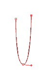
Color it and make a line in the middle if you want to. If your feather wasn't perfect or you didn't like it, don't delete it, instead try using the white arrow. Yes, the white arrow. Not the black, but.... the white! If you don't know where it is, look in the tool box, and it's next to the black arrow: 
With the white arrow, you can adjust everything. If something is grouped the white arrow will only select 1 item, even if it's a group of 100 items. It can also adjust the arch of a drawing, change shapes and delete a point from a drawing.


Step 2) Use Pen Tool to draw a rough drawing of the parrots figure. Then you can adjust it using the white arrow until your happy with the look. Fill it with a color. When your done, i have some tricks to make the rest easy. Copy it ( hold down alt + drag it + release it). Parrots have amazing, beautiful colors on their feathers, and they also have different colors on their face, feet, eyes, beak and so on. You now have 2 of the same form. Select the rubber, and simply use it as a marker and draw the lines for your new form. With doing this, it's easier to make the new form fit to the old one. Shown on pics below:

Here have I used Eraser Tool to draw a line.
Just place it on top of the first form.

I think this is an easy way to make for example wings that fits with the original form, if you get what I mean... If not, look at the pictures. NOW, the feathers. How to start? I recommend that you start on the bottom and work upwards, then the upper feathers will overlay the others. As you can see in the picture I've already started to place the feathers. Hold down Alt and drag a new feather, instead of copying every single feather, and then paste them; followed by placing every feather. Lot of work. Keep copying using Alt, and you can also reflect them to create variation. To reflect something, right click - transform - reflect. Working with so many objects can be frustrating. To get control on your artboard or workplace, go to Window in the menu. Choose Layers. This wonderful window pops up, and there will probably be many, many, many items there. You can separate them with throwing some into other layers, or group them. Mark all the feathers of the same color, and group them using: cmd + g, ctrl + g, go to Object in the menu or simply right click. As you see it's many ways.
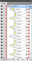
It's better to group items
so you don't have to search
through all.

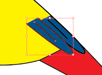
I started with the blue feathers. When I've come to the end of the wing, i start placing yellow feathers over the blue. Don't focus on getting them perfectly on to each other, you can make some space. It may look like this:
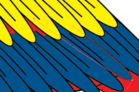
If you use the white arrow, you can make the feathers longer so the colors fill all the missing parts.

Step 3) Strokes are important when it comes to drawings. If the stroke is the same size, it may look boring. IF the size vary, and the strokes are different it can make the drawing look better. Heres an example:
On the strokes in the face, I use an other type of stroke than I did on the rest of the parrot.

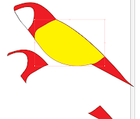
Enough of this babbling, here is 1 out of 3 parrots that I made in our task to make a Book cover:
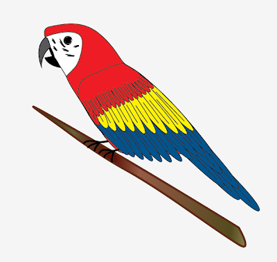
PS: See if you can find the image that was the inspiration to this one, you can find it on Google if you search for Ara in pictures. *Hint* it is a parrot that sits in a tree, just like this one.
I will publish my book cover later, and I will perhaps tell you how to use Gradient Tool and some nice effects combined with Pixelerate in Illustrator. I hope this helped. Remember that Pen Tool is easy to draw cool or pretty or nice or just draw something in Illustartor. If you're not steady on your hand, use the White arrow to adjust the lines and arches etc. The white arrow can also edit items in groups, which the black arrow can't.

Have a nice day!
Published 21:07

onsdag 18. mai 2011

Fading between images in Photoshop

Here is a tutorial on how to fade images in Adobe Photoshop CS5 (it works in CS4 also).
First of all, open Photoshop. Then, go to File > Open. Choose an image you want to use. Then, repeat and open another image. When you have two images, one in each folder, use the Rectangular Marquee tool and mark the area you want from the image.
 Selected area 


If you can move the marked area, but not move the picture, be sure to have the "Subtract from selection" -button selected:
Subtract from selection
After selecting an area use the Move Tool to drag it over to the other image:
You can either have two separate windows or drag and release
 it by holding over the folder.


Now, if you don't have the layers window open go to Window > Layer. You will now have two layers, containing your images. The first layer, named Background, is locked. Double-click on it and press OK. Drag the image-layer you want to fade out on top.

Layer Window - removing the locked layer


I chose the landscape image to be faded out, and the bubbles to be in the background. Then, click on the upper layer and click on the "Add Layer Mask" -button.


The "Add Layer mask" button is right next
to the "fx" button.
There will now appear a white rectangle on the layer. Make sure the rectangle is marked (mark it by clicking on it) before the next step. To make these images or layers fade, I use the Gradient Tool that 
Gradient effects
can be found in the Tool box. When you activate it, the tool bar for Gradient tool appears on top. Choose one of the effects, I would recommend "Foreground to Transparent". 
Now comes the funny part: click and hold anywhere on your image and drag in the direction you want and Voila! You have a super-amazing creative and action filled image!!!!! You can also use different type of gradients like shown in the picture, those tiny black and white icons.


Here is my image:
If you look to the right you can see how much of the image that is faded by looking at the second picture on Layer 0. You can also fade several images and make a collage, you only have to use layer mask on every image you want to fade, and remember to be in the correct layer and layer masks when your using Gradient tool. Here is an example that I made for fun. I combined 5 images:


Hope this helped :)
Have a nice day!
This supplication was published 14.43.

lørdag 23. april 2011

Life isn't perfect!

Life isn't perfect, even for Disney characters. We were going to make a short movie, photo or a cartoon that contained a scene from the life of a Disney character, or any character that we knew when we were children. The scene could be when the character was grown up or a teenager and so on. The characters were tiny and innocent, but we should tell the rest of the story and choose if it was still as perfect as before, or not. Me and my group chose to make a movie about Teletubbies. As you may know, they are sweet and cute, and they wouldn't even hurt a fly. But, in our movie... they've chosen the DARK side! Hehe. They have become criminals and they are sought by the police. This task was also a way to try out different genres in movies. We got the genre Slasher, which is a scary movie like Scream, Halloween, etc.
In a Slasher movie there is certain rules:
The killer is the point of view or if you see him he usually wears a mask.
If you say be right back you wont be back.
If you open a door to a closet and theres no music, the killer is behind you.
The plot usually takes place at night, or where there's dark, except in our movie :P
There is more rules, but if you have an Internet connection you will be able to Google these rules on your own... :P

There were five groups that together made five movies that can work as a movie on their own, and together with the other movies. Every movie had different genres and completely different stories. One of the movies connected the rest and was the "frame story" of the movie. There is some objects or characters you will see in more than one of the movies, and that is how we connect them.

Have a nice day!
This supplication was posted at 19.40.

tirsdag 5. april 2011

Do you like sardines?

Howdy! Our pro class got invited by MUST (Museum Stavanger) to a guided tour and a sardine label contest! All vg1 MK students in Rogaland were invited. We were going to make a design based on the task; Make adolescence eat more sardines. We could only use Adobe Photoshop and Illustrator for this task. Well, here is the design that I made:


I only used Adobe Illustrator CS5 to make this design. I've used Pen tool, graphic styles, fonts, brushes and symbols to make this design more Western like. The Factory name is "Sheriffen"(the sheriff). Sheriffen has "produced" a new sardine type: Sandines, sardines for tough people! The secret ingredient is a taste of gunpowder smoke that helps you forget the old and regular sardine taste. To the right, you can see an unusual, weird looking, kind of fishy-like sardine with green skin. He is one of the sheriff sardines inside this sardine-can and he's skin color is the same as a cactus. Be careful, this Sheriff-cactus-sardine has a gun! To prevent this sardine from escaping his can, I've set some barbed wires around it so you can be safe. Well, that's pretty much it, I'll consider whether I'll make a tutorial on this or not until then;
Have a nice day!
OH! I almost forgot an important part of the contest: The award :D From the schools that where invited, about 4 or more schools, 10 of the best designs could win nice prizes, whatever nice prizes was supposed to be. On top of this supplication I mentioned our "pro class", and since "pro" means to get payed by doing something you like to do, our class could be named that from now on because 7 out of top 10 designs came from our class, and we won T-shirts that is worth money so we kind of got payed for our work! My design made it to the top 10, yay me! Sorry for bragging, but it was very awesome indeed. Have a nice day, and look forward to the approaching Easter vacation :D
This supplication was posted 19.39

tirsdag 22. februar 2011

Project L

Our class were going to make a Logo which represents a store or a product. In this task, much planning had to be done. Before we could use our creative skills to make this Logo, we had to figure out a "Concept". This concept had 4 parts: "What" is it, "Who" are you trying to reach with it and "Which" associations do you want to make and "How".
     On the first step, "What", I chose my store/achievement to be a Pancake restaurant with a forest theme. The main idea was to make it look like you were outside, when inside. Get it? It should be sold cheap pancakes.
     Step two, "Who": My target group is: Hiking -, Nature-loveing -, Lumbering -, Pancake-eating - people. With other words, people that likes pancakes as a meal on their trip.
     Step 3, "Which": The associations I wanted to make were: Relaxed, Fresh nature etc. With my logo, i set these thoughts in centre. What do you think about when you see this logo?

 And this logo is how I want to bring the associations to my target group (Step 4).
The Orange tree can associate nature, life, or a tree.
The blue circle can associate the sky, a circle or even a pancake.
The wooden font can associate wood, forest or western, depends on each person.

When this information were done, we could start making the logo. I found the name Pancake Cabin, and I used the two first letters in the words to make it be PaCa. It is easier to remember, and faster to pronounce. PaCa PaCa PaCa. If someone wonder how I made this logo, I only used Elipse tool and Pen tool. Otherwise i used the Text tool for the text. When my logo was completed, the Design-manual was next in line. It contained 7 tasks :O.
1) Make the logo in colors and black and white. Try it with different color backgrounds.
2) Write the fonts you used.
3) List up the colors you used in the logo and the number in both CMYK and RGB.
4) Decorative element.
5) Make a business card.
6) Use Photoshop to make the "facing".
7) Free choice element, make the logo on a cup, car, cloth etc.
Wow, this is much to do, don't you agree? Well, here is my way to do it:
On the upper left, you can see step 1. Below step 2 and 3. Lower left is the Business card. Upper right is the Facing and on the lower right you can see step 4 and 7, where I've used my logo on two elements. Ta-da. 
This manual is a guide on how you can show a product to a customer. This is my logo, and maybe you one day will see it on a facing? Who knows?

Have a nice Day!
This was posted 12:52

tirsdag 11. januar 2011

The evil Giraffe named Stig

You have already met my awesome giraffe, and now he's in a cartoon! First, some background info about this giraffe: He is 11 years (human year) which is very old for a Giraffe. They can live 10-20 years. He lives on the north pole because he works as a santa claus substitute. That's why he's wearing a santa hat. When he was younger, he experienced something terrible. He didn't get anything of what he wished for christmas, and now he is trying to make that happen to all the other children in the world. Very sad story, actually. But, someone is suspicious about this evil giraffe, and tries to stop his plan. It is the hyena Nils! He is an agent sent by the hyenas to stop him. Well, enough of this, lets look at the cartoon instead:
The text is a little hard to read, because this was the largest file i could upload, and it's written in Norwegian. In the first route Stig climbs a tree to see if there are no hyenas. 2. He says: "To the secret lab!" and the lab is on a toilet. 3. "When I push this button, no letters will arrive to santa, and my plan has come true!" did he say just when: knock knock ... BANG! The hyena Nils kicked down the door on Stig. 4. "Nils the hyena, you will regret this! Mohahahah!" and he pushes the button. "Go Robot-Giraffe!". Robot-giraffe: Loading... Loading... Loading completed bip bip. Then Nils says: -Teleport activated- and teleports out of the house. Stig doesn't understand what just happened. 5. Stig: "Robot-Giraffe attack!!!" Nils: "Are you kidding me?..." Nils uses a karatèkick to stop his attack. Stig yells NOOOOOOOO, and Nils says "Mission completed". The End.


Im not gonna make a tutorial on this one, because it would take a year. I made everything in Adobe Illustrator CS5.
Click on the image to see it larger.


Have a nice Day!
This message was posted 12.20